
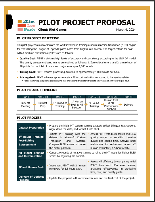
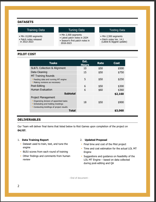
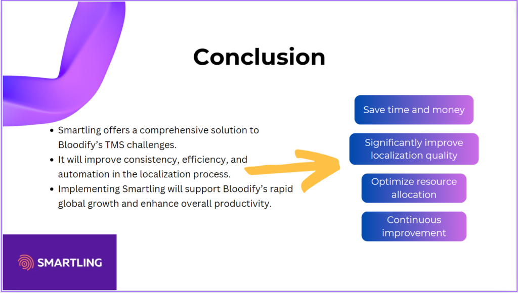
Drawing Survival: Localizing a Webtoon Reality Show
Description
Since my youth, I’ve always enjoyed reading comic books, a passion that has continued into adulthood. Despite the never-ending grind of graduate studies, I still found time to read Webtoons on my phone. For those unfamiliar, Webtoons are digital comics that have taken Korea by storm. They are so popular that there are TV programs featuring webtoon artists who share their artistic journeys and life stories.
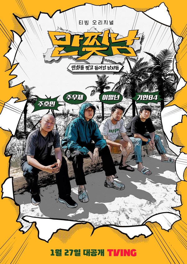
One program caught my eye, not just because it whisked three webtoon artists off to a deserted island, but because it immersed them in a vibrant webtoon world. Picture this: a deserted island where these artists have to use their creativity not just to draw but to survive. Their real-life situations often blur with the fantastical webtoon world they create, making for a narrative that’s as unpredictable as it is engaging. The TV show cleverly unfolds like the comic books they create, featuring each artist’s unique art style in the background, further blurring the lines between reality and the webtoon world.
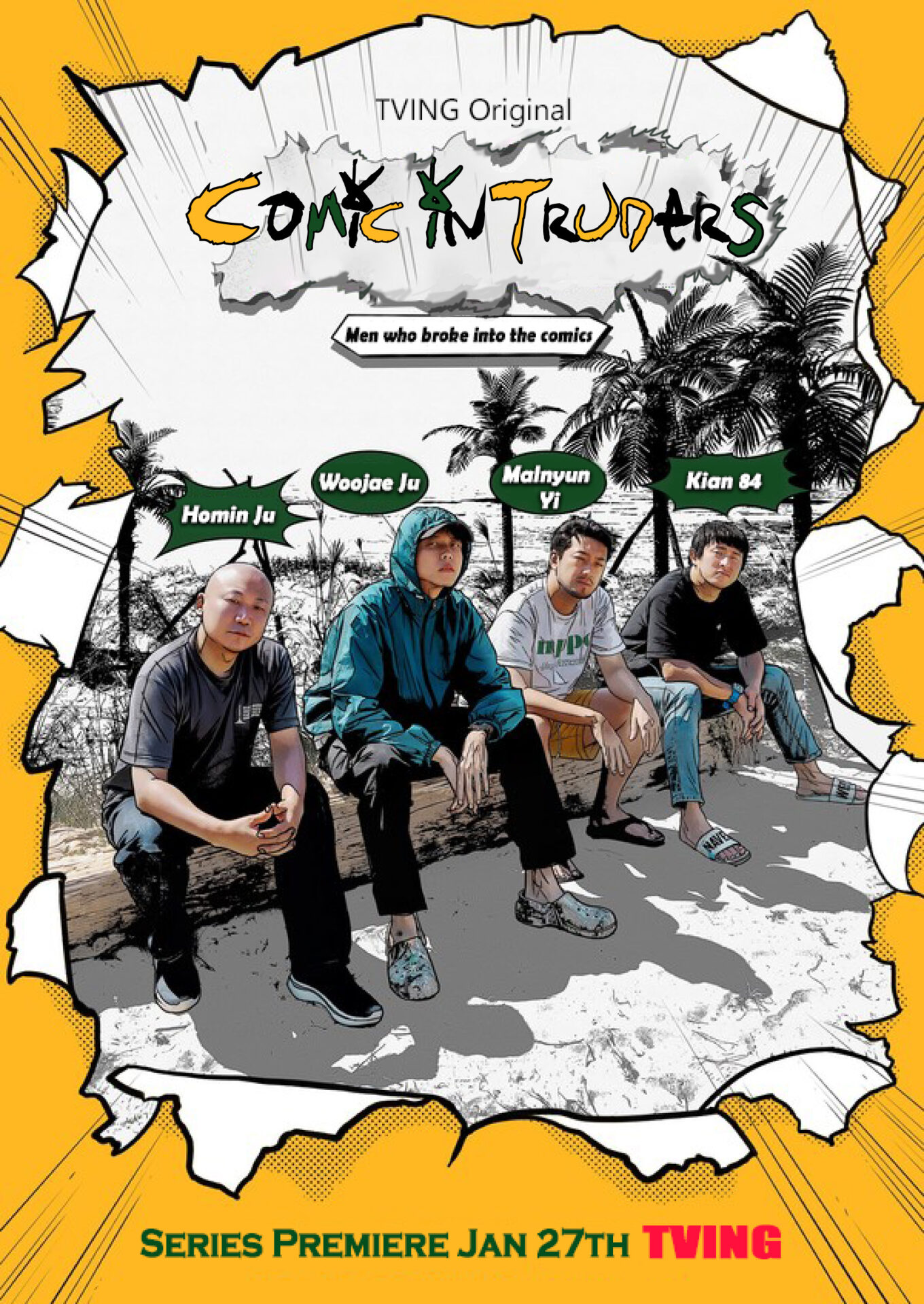
Inspired by this creative chaos, I took on the challenge of localizing the show’s poster into English using Adobe Photoshop and Illustrator. It was a fun task, turning “만찢남” into “Comic Intruders” while maintaining the poster’s original vibrant style.
Workflow Overview

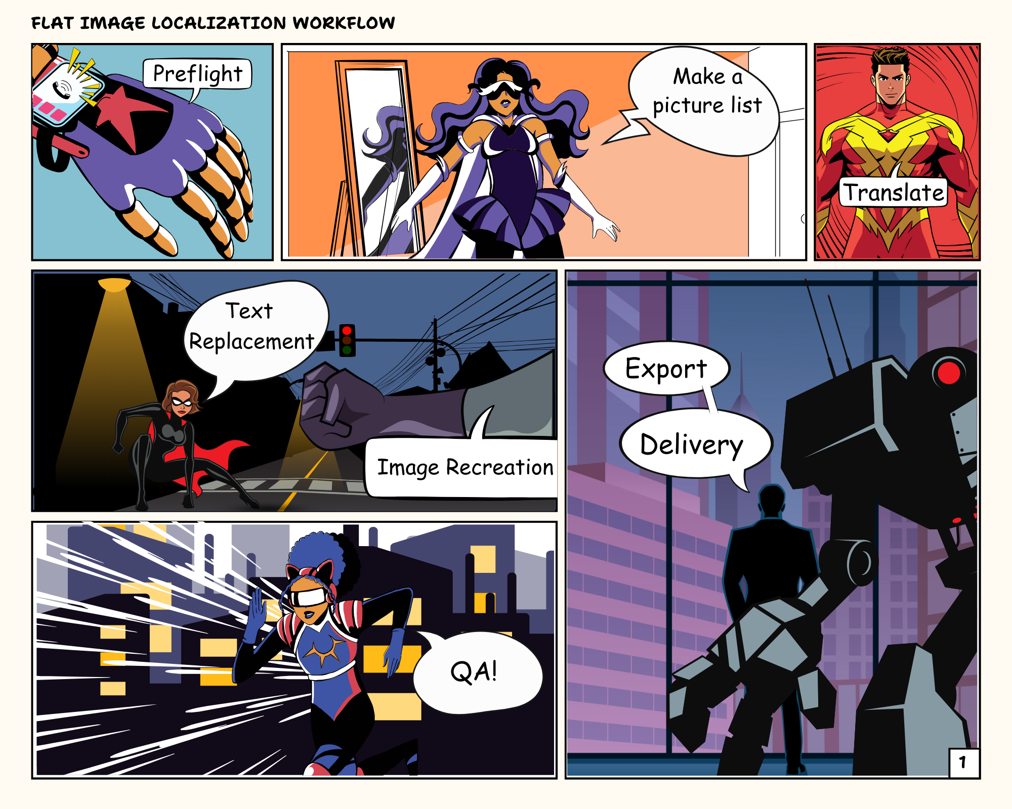
1. Preflight
- Download and Open the Image: I downloaded the image file and opened it in Adobe Photoshop. Since I couldn’t find the original source file, the resolution of the image wasn’t ideal.
- Check for Localization Issues: I examined the file for any potential localization hiccups, like speech bubbles that might burst under the pressure of text expansion.
2. Make a Picture List and Translate
Once the scanning was done, I started creating a picture list for translation. I set up an Excel sheet, organizing it to include both the original Korean texts and their English translations. Given that there wasn’t a vast amount of text, I dove right in and translated the Korean texts directly within the picture list.
Transcreation Challenge
When translating, I transcreated the title of the poster. The original Korean words were coined to fit the unique style of Webtoon, so I had to get creative to maintain the original essence. For instance, the title ‘만찢남’ (literally “men who rip the comic book and came out of it”) is a playful expression used to describe an unrealistically handsome guy. Capturing this in English while preserving its quirky charm was the hardest part of the transcreation process.
So, how do you coin an English title that encapsulates all those meanings? That was the real puzzle, but it’s all part of the fun in bringing these vibrant Korean Webtoon elements to an English-speaking audience.
3. Text Replacement and Image Recreation
- Removing the Korean Text (Photoshop)
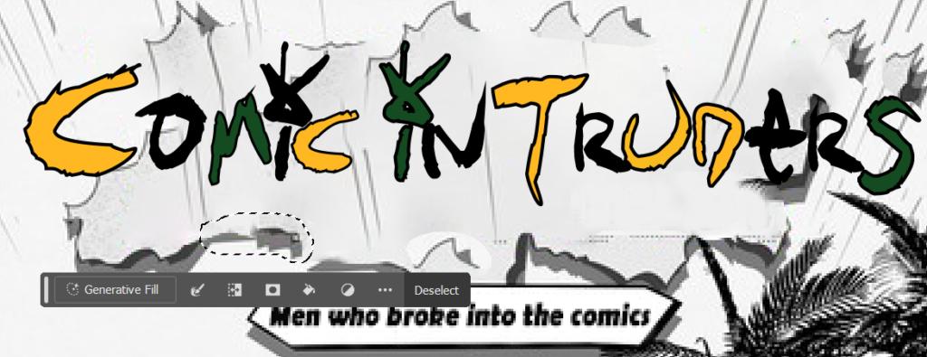
- I started erasing the Korean text using Content-Aware Fill. It worked pretty well, and I successfully removed all the Korean letters except for the title.
- Inserting Translated Text (Photoshop)
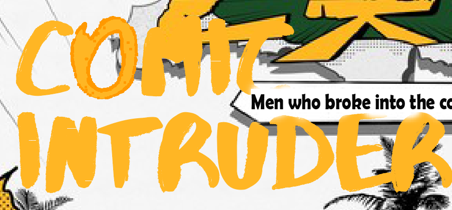
- Before adding the translated text to the file, I hunted for fonts that closely matched the original. Due to text expansion, I reduced the font size and realigned the text to fit within the speech bubbles. To mimic the original style, I tweaked the stroke and weight and added shadows to the text. Everything was done except for the title, which was the biggest challenge of this project. The title was more like a graphic design than text, requiring a complete image recreation for localization into English.
- Image Recreation (Photoshop & Illustrator)
- First, I tried to remove only the text without erasing too much of the background using Content-Aware Fill, but it wasn’t easy. Hmm, this would need some manual work. But first, let’s head to Adobe Illustrator. I created the text and turned it into vector graphics to deform it to fit the style. Keeping the original style was tough, so I used my creativity and designed it in a comic style. Then, back to Photoshop for the final QA.
4. QA
Final Touches: With the background and outlines looking sharp, I made sure every element was perfectly aligned and polished.
Objective QA: To ensure everything was spot on, I sent the file to a few friends for an objective QA. They provided fresh eyes to catch any details I might have missed.
5. Delivery & Final Thoughts
With the QA completed and all elements polished to perfection, I exported the final localized image to a high-quality JPG file. The vibrant, comic-style design retained its original charm, now ready for an English-speaking audience. I see that the image recreation is far from perfect; however, in this project, I mostly focused on text localization and recreation. In future projects, I aim to practice more graphic redesign and delve deeper into graphic tools to enhance my skills. This task, blending meticulous detail and creative problem-solving, was a testament to the power of visual localization. As I sent off the finished file, I couldn’t help but feel a sense of accomplishment, excited for the next creative challenge that lay ahead.

Source: Naver Entertainment. “Article Title.” Naver, 2023, https://m.entertain.naver.com/article/311/0001544194.
Copyright Disclaimer: under section 107 of the Copyright Act of 1976, allowance is made for “fair use” for purposes such as criticism, comment, news reporting, teaching, scholarship, education, and research. This project is a proof-of-concept, and as such does not represent nor infringe on the creator(s) in any way.